image 12

Q4T
Visit The Secret Wiki.

Re: image 12

Postby NYCNative » Thu Jul 18, 2019 3:50 pm

Choice wrote:Was someone's posts removed? Pages look out of whack.

I think these puzzles have been over-analyzed to death. How about the old fashioned way of finding image matches and connecting the dots?
Here are a couple of possible matches:
The ship bows on Columbus Circle look like the seagle or eagull feet. There are 3 to the E and 3 to the W.
Also the bow of the USS Main looks like the eagull's wing.

https://tinyurl.com/y5eza2x8
https://tinyurl.com/yxdqzp43

Image


Image
NYCNative
Moriarty
Moriarty
 
Posts: 383
Joined: Sat Feb 17, 2018 5:31 pm

Re: image 12

Postby Kang » Thu Jul 18, 2019 3:52 pm

phrabbott wrote:
Kang wrote:So is the color closer to maroon or purple??


My only concern with color things is the printing process. We've seen that Image 9 turned more of a mustard brownish than the vibrant gold that it was originally. That would indicate that this square might actually be more of a brighter magenta IRL, and would certainly take it away from the Purple end of your argument.

That being said, I like what you're saying and do think it's worth some hive mind investigation.


Ah, but that's why I included the Image 7 comparison. As long as you think I7 is NOLA, the colors there are supposed to be purple. Right? Not magenta or Maroon.
It is reasonable to assume that whatever color deviations happened in the printing process happened to all images, not just one.

If that is the case what you propose above should have happened with both. So JJP's "original painting" color for both 7 & 12 started as a form or purple or a form of maroon/magenta. And based on NOLA/Mardi Gras, maroon/magenta don't make any sense (to me).

Image
You can learn all you need to know about a person by how they treat strangers on the internet - Confucius
User avatar
Kang
Moriarty
Moriarty
 
Posts: 303
Joined: Wed Mar 14, 2018 10:14 pm

Re: image 12

Postby Choice » Thu Jul 18, 2019 4:05 pm

NYCNative wrote:


There's no point arguing with an angry nothingburger.

Image
Aut viam inveniam aut faciam
User avatar
Choice
Adler
Adler
 
Posts: 3302
Joined: Sun Aug 19, 2018 7:51 pm

Re: image 12

Postby Kang » Thu Jul 18, 2019 9:48 pm

Choice wrote: I think these puzzles have been over-analyzed to death. How about the old fashioned way of finding image matches and connecting the dots?
…the bow of the USS Main looks like the eagull's wing.

Image

Not sure I believe I’m actually going to say this out loud.
Choice and I actually agree on something in Image 12.
Well, sorta.

Yes, I believe that part of the bird’s wing may well have been inspired by the USS Maine monument at Columbus Circle.
And maybe a few other parts of the bird.

However, I also believe that if you don’t know the answers to the “why” questions…
https://getyarn.io/yarn-clip/a1a2ca7e-9c84-4036-9288-120d94acac7c

Choice wrote: I think these puzzles have been over-analyzed to death. How about the old fashioned way of finding image matches and connecting the dots?
Because if one tries to solve this the “old fashioned way” like Cleveland/Chicago - I''m pretty sure that’s going to work…
You can learn all you need to know about a person by how they treat strangers on the internet - Confucius
User avatar
Kang
Moriarty
Moriarty
 
Posts: 303
Joined: Wed Mar 14, 2018 10:14 pm

Re: image 12

Postby Choice » Thu Jul 18, 2019 11:01 pm

Another thing popped into my head!
The horse/Pegasus looking thing present in the seagle.
Pegasus was fathered by Poseidon, god of the sea.

Connection to the Chrysler building?

Chrysaor was the brother of the winged horse Pegasus and son of Poseidon and the Gorgon Medusa. When Medusa was decapitated by Perseus, both Chrysaor and Pegasus were born at the same time. Little is known about Chrysaor; he was considered a stout-hearted warrior, and his name means "he who bears a golden sword".

Image
Last edited by Choice on Thu Jul 18, 2019 11:28 pm, edited 1 time in total.
Aut viam inveniam aut faciam
User avatar
Choice
Adler
Adler
 
Posts: 3302
Joined: Sun Aug 19, 2018 7:51 pm

Re: image 12

Postby Kang » Thu Jul 18, 2019 11:19 pm

Symbols of Russia and JJP's design and color choices - Part II (B)

See Part I here: http://quest4treasure.co.uk/phpbb3/viewtopic.php?f=32&t=754&start=1320#p154801
See Part II (A) here: http://quest4treasure.co.uk/phpbb3/viewtopic.php?f=32&t=754&p=154835#p154824

Durian wrote:The Romanov coat of arms is really intriguing, with the same blue color and the tri-pattern. Do you have any thoughts on how the Romanov family might be a clue for something? Or point in a particular direction?

More symbols of Russia.
The colors Purple, Green and Gold are associated with Moscow/Russia and are the Romanov family colors.

Moscow coat of arms. Includes Purple, Green and Gold. (And that blue from the domes again).
Image

Image

Wait, aren't those the same as Mardi Gras colors? Yup - and there's a reason for that. They were made the official colors to honor a Romanov prince who visited during the festival.
https://www.mardigrasneworleans.com/history/

That's why I believe JJP used these (disguised) colors in Image 12. Because they are a symbol of Russia and the Romanovs.
The two squares. Purple and a light goldenrod. And the green dots/bubbles next to it.
Green? Those are not green!
Here me out. Take a look at Image 7. It should by all rights have purple, gold and green. First two - check. Green?
The squares at the top of the image are a light shade of green/teal.

He uses the SAME EXACT color in that bubble panel in image 12. Take a look.
So I propose those colors in Image 12 are purple, green/teal and a pale, pale gold. A Russian clue.

Image

Others may not like it and that is fine. But I would say - it's a puzzle people. It's not supposed to be obvious. They are hiding the clues.
Are the coordinates in the the images in a regular, standard type-face font? No, they're hidden as hell. Hard to find. The clues are not easy.
If JJP wanted the clues to be easy - he could have used the colors below for both paintings and people would have figured it out real quick.
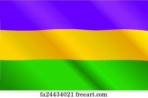
Image

Give these interpretations a chance. Think differently. That's all I'm asking.
You can learn all you need to know about a person by how they treat strangers on the internet - Confucius
User avatar
Kang
Moriarty
Moriarty
 
Posts: 303
Joined: Wed Mar 14, 2018 10:14 pm

Re: image 12

Postby Choice » Fri Jul 19, 2019 4:28 am

This thread went quiet. Lets stir the pot!
Top half of this image is on page 67 of the book.
Got domes ova hea'


Image
Aut viam inveniam aut faciam
User avatar
Choice
Adler
Adler
 
Posts: 3302
Joined: Sun Aug 19, 2018 7:51 pm

Re: image 12

Postby XeroDM » Sat Jul 20, 2019 2:04 am

I wouldn't give too much time to a zoomed in version of an offset printed and scanned image.
Is it maroon? Is it magenta?
Well, the printing process is such that it's not either. You will notice the dots on most all scanned images that were offset printed when zoomed in. The print is actually a series of dots next to each other that are visually combined in your brain when you look at it. In art terms, it's called optical mixing. Simply put, you're not supposed to view a square millimetre of the image in isolation. When scanned, these images and the pixel-by-pixel scanning process do not line up, and the scanner interprets the colour of that pixel because the printed dot does not align with the border of the pixel. What needs to be done when scanning is a process called "descreening" where the scanned data is equalised with neighbouring pixels, to create a less dotty image without the 'artefacts'. This process probably wasn't done when scanning the book that we are now working off of.
Also, any printer will tell you that matching blue shades is nigh on impossible. And matching anything with a blue shade in it (purple, green, etc.) is made more difficult due to the presence of the blue.
If you want do any close up analysis, you are best to do it on the original image. Give JJP a ring and see if you can just have a quick look at them. Good luck with that! ;) That's the only way you will know what colour anything is, and what is or isn't there at a small scale.
Remember that JJP said that the printed book wasn't a great reproduction (and the reprint was worse), but that aside, none of the necessary information was missed in the print in the book.
Maybe we should be doing what was recently suggested and taking a step back and looking at the image as a whole, rather than pixel-by-pixel. IMO that is a better way forwards.
X
XeroDM
Lestrade
Lestrade
 
Posts: 96
Joined: Thu Nov 29, 2018 12:16 am

Re: image 12

Postby gManTexas » Sat Jul 20, 2019 2:53 am

XeroDM wrote:I wouldn't give too much time to a zoomed in version of an offset printed and scanned image.
Is it maroon? Is it magenta?
Well, the printing process is such that it's not either. You will notice the dots on most all scanned images that were offset printed when zoomed in. The print is actually a series of dots next to each other that are visually combined in your brain when you look at it. In art terms, it's called optical mixing. Simply put, you're not supposed to view a square millimetre of the image in isolation. When scanned, these images and the pixel-by-pixel scanning process do not line up, and the scanner interprets the colour of that pixel because the printed dot does not align with the border of the pixel. What needs to be done when scanning is a process called "descreening" where the scanned data is equalised with neighbouring pixels, to create a less dotty image without the 'artefacts'. This process probably wasn't done when scanning the book that we are now working off of.
Also, any printer will tell you that matching blue shades is nigh on impossible. And matching anything with a blue shade in it (purple, green, etc.) is made more difficult due to the presence of the blue.
If you want do any close up analysis, you are best to do it on the original image. Give JJP a ring and see if you can just have a quick look at them. Good luck with that! ;) That's the only way you will know what colour anything is, and what is or isn't there at a small scale.
Remember that JJP said that the printed book wasn't a great reproduction (and the reprint was worse), but that aside, none of the necessary information was missed in the print in the book.
Maybe we should be doing what was recently suggested and taking a step back and looking at the image as a whole, rather than pixel-by-pixel. IMO that is a better way forwards.
X


:app)

I couldn't agree more.
gManTexas
Adler
Adler
 
Posts: 1295
Joined: Tue Jan 23, 2018 12:26 am

Re: image 12

Postby Choice » Sat Jul 20, 2019 3:51 am

XeroDM, all true. However most of us work with what we got which is Wiki scan, 12treasures or worse the PDF version of the book. The best resolution is 12treasures scan (Thanks again George!). Problem with 12T's scan is it's too large/high-res. therefore, as you noted too sharp and dotty. I found a simple remedy for that. You can merge the neighboring dots by using "soften" function of some graphics programs. This is basically the opposite of "sharpen". Here's a before and after:

Image
Aut viam inveniam aut faciam
User avatar
Choice
Adler
Adler
 
Posts: 3302
Joined: Sun Aug 19, 2018 7:51 pm

Re: image 12

Postby maltedfalcon » Sat Jul 20, 2019 4:10 am

Choice wrote: You can merge the neighboring dots by using "soften" function of some graphics programs. This is basically the opposite of "sharpen".


Actually what you want is Moire pattern removal.
usually under the filters or photo tools.

Soften actually adds data to round edges
To be honest so does Moire pattern removal it just does it in a more uniform fashion and is less likely to generate artifacts.
User avatar
maltedfalcon
Adler
Adler
 
Posts: 2510
Joined: Mon May 19, 2003 9:29 pm
Location: Northern California

Re: image 12

Postby Choice » Sat Jul 20, 2019 4:23 am

Can you post a processed result of my before image Matt?
Aut viam inveniam aut faciam
User avatar
Choice
Adler
Adler
 
Posts: 3302
Joined: Sun Aug 19, 2018 7:51 pm

Re: image 12

Postby XeroDM » Sat Jul 20, 2019 3:48 pm

I think the point was just missed...
If you manipulate data in photoshop, GIMP or whatever... you are manipulating data that is already not likely to be what the original was.
If you use sharpen and soften over and over again enough times, and compare the original image with the manipulated image, you won't get the same thing. Data is changed when you do that. Which makes it inherently different.

The photo process changed the colours (due to lighting, film type, etc.)
The printing process changed the colours (due to the printing process being made of dots, not the actual colour. Also, it's made of only 3 (RGB) or more likely 4 (CMYK) colours, which cannot accurately reproduce the pigment-in-medium that is paint)
The scanning process changed the colours (due to technical limitations of the scanner, the pixel-to-dot offset which causes the moire pattern)
The photoshopping changes the colours (by averaging neighbouring pixels, etc)
Even the saving process changes the colours (if you have set certain settings such as colourspace, RGB/CMYK, compression ratios, file type, etc)
So if we are to believe that what we have at hand is correct, I think we are kidding ourselves...

And why would a possible solve rely so heavily on the exact colour of an area of an image?
JJP had a lot of experience with painting images and getting them printed on book covers etc. BP was in the business of writing and printing books. It's fair to say they knew what was going to happen when they painted a picture and got it printed in a book, and consequently wouldn't have relied on something that was outside of the technical abilities of the medium that they chose.
Purple is purple.
There's plenty of unexplained images that are easy to see which are more likely to yield results than scouring over pixels and exact RGB colour mixes...
Just my opinion!
X
XeroDM
Lestrade
Lestrade
 
Posts: 96
Joined: Thu Nov 29, 2018 12:16 am

Re: image 12

Postby NYCNative » Sat Jul 20, 2019 4:06 pm

XeroDM wrote:I think the point was just missed...
If you manipulate data in photoshop, GIMP or whatever... you are manipulating data that is already not likely to be what the original was.
If you use sharpen and soften over and over again enough times, and compare the original image with the manipulated image, you won't get the same thing. Data is changed when you do that. Which makes it inherently different.

The photo process changed the colours (due to lighting, film type, etc.)
The printing process changed the colours (due to the printing process being made of dots, not the actual colour. Also, it's made of only 3 (RGB) or more likely 4 (CMYK) colours, which cannot accurately reproduce the pigment-in-medium that is paint)
The scanning process changed the colours (due to technical limitations of the scanner, the pixel-to-dot offset which causes the moire pattern)
The photoshopping changes the colours (by averaging neighbouring pixels, etc)
Even the saving process changes the colours (if you have set certain settings such as colourspace, RGB/CMYK, compression ratios, file type, etc)
So if we are to believe that what we have at hand is correct, I think we are kidding ourselves...

And why would a possible solve rely so heavily on the exact colour of an area of an image?
JJP had a lot of experience with painting images and getting them printed on book covers etc. BP was in the business of writing and printing books. It's fair to say they knew what was going to happen when they painted a picture and got it printed in a book, and consequently wouldn't have relied on something that was outside of the technical abilities of the medium that they chose.
Purple is purple.
There's plenty of unexplained images that are easy to see which are more likely to yield results than scouring over pixels and exact RGB colour mixes...
Just my opinion!
X


I can surely understand both perspectives on this debate but the simplistic approach to this problem is having faith that the makers and contributors of the book, especially JJP, have no reason to believe that the distortion and degradation of the images will affect the hunt. I think we should leave it at that. no?
NYCNative
Moriarty
Moriarty
 
Posts: 383
Joined: Sat Feb 17, 2018 5:31 pm

Re: image 12

Postby Choice » Sat Jul 20, 2019 5:16 pm

XDM, my preferred choice is still using the original book and a 5X magnifying glass. That said, these books are getting pricey and I hate wearing my cotton gloves to handle the book. So I really don't see a problem using a copy of the image and manipulating it enough to get it as close to the original as possible. Unless your are one of those searches that looks for microscopic lines, shapes and letters for nonexistent clues. Otherwise it's all good.
Aut viam inveniam aut faciam
User avatar
Choice
Adler
Adler
 
Posts: 3302
Joined: Sun Aug 19, 2018 7:51 pm

PreviousNext

Return to The Secret

Who is online

Users browsing this forum: atdreamer2112 and 6 guests